How I improved an inferential data analysis tool for pharmaceutical business analysts
Core Team
1 Senior UX Designer (Me)
1 UX Designer
1 Lead Developer
3 Front-end Developers
2 Product Managers
1 Product Owner
Leadership/Stakeholders:
Principal of ZAIDYN Connected Health
Client Contacts
My Contributions
Led user research
Led discovery workshops
Pain Point/Goal Analysis
Persona crafting
User Journey
Design Strategy
Product Requirements Shaping
Product Roadmap Planning
High-fidelity Figma Designs
Tools
Figma
ZAIDYN Design System
Confluence
JIRA
Outcomes
Product launched with 5 different clients
$550k in revenue
My first project as the new lead (and only) designer for ZAIDYN Connected Health (ZCH) was redesigning a newly acquired product called Studio Medical Insights.

I eventually learned that the product was actually an amalgamation of 2 different products, each designed by a different design team.
I had never encountered anything like this, and wanted to get to the bottom of it all.
Unfortunately, the original designers had left ZS, and all their research and foundational design elements were lost.
Competitive analysis was also a good source for research. I wanted to know what features we lacked, and where we stood out.
This blurry picture of a direct competitor was stealthily taken by one of our product managers at a trade show.
Welcome to the cutthroat world of pharmaceutical business intelligence, baby.
My research indicated 3 key themes:
1. Functionality was not on par with competitors (Not modern or intuitive)
2. UI lacked consistency, color, and motion (Not modern)
3. Slow loading and performance (Not user friendly)
I then led a prioritization exercise where to determine what improvements could be done in the near vs. long-term.

At this point, I realized I was still unclear on the users and value of Studio.
How was I going to lead a re-design when I barely knew how the product worked?
I needed to take a step back and really understand the foundational aspects of Studio
To accelerate the discovery process I scheduled working sessions with the PMs and developers.
I needed to establish a foundational understanding of:
The user persona(s)
The user journey
How Studio addresses user goals and frustrations.

I learned that a role at one company might be split into 2 specialized roles at another company, or vice-versa.
In an effort to simplify our understanding, I consolidated the user personas by combining roles with overlapping responsibilities, skills, and goals.
Initial discussions with key stakeholders and product owners uncovered a wide range of potential users.
The range potential users seemed strangely long, and I noticed some overlapping responsibilities…
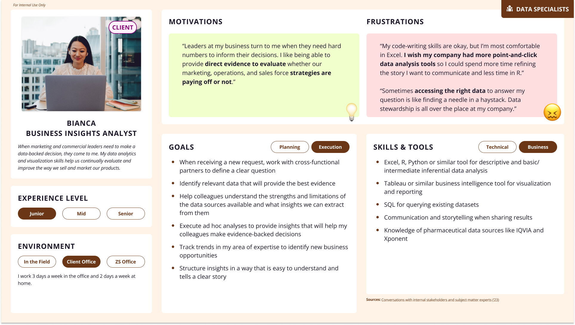

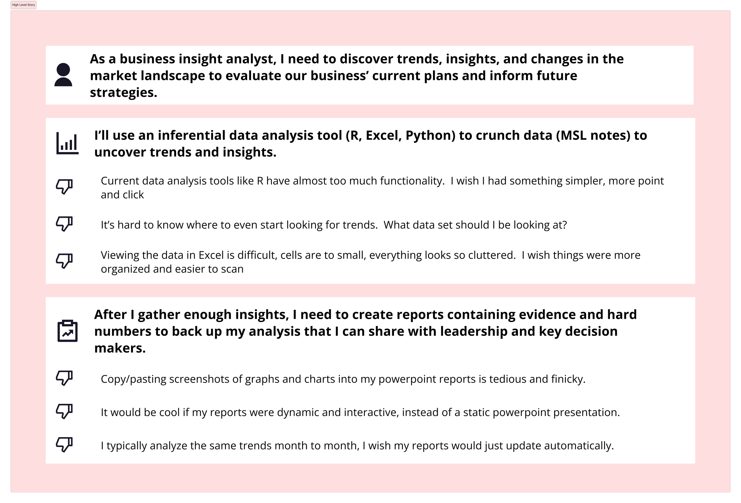
We determined that the Business Insight Analyst would be the main user of Studio, so I created a high level user journey.
This was key in forming my understanding of the pain points the analysts were facing, and how Studio would address them.

Since I didn’t have access to end-users, I went to those closest to them: our client contacts and product owners.
I conducted moderated usability testing with our contacts and product owners.
Any time words like “modern” or “intuitive” popped up, I’d ask them to describe what those words meant, and to tie it to what they were seeing.


But in order to make user-centered improvements, I sought out user research and feedback.
There was previous research, but none conducted by a UX researcher, so vague phrases such as “Not intuitive”, “Not modern”, and “Not user friendly” were frequently used.
Designers hear these phrases so often, they’re almost meaningless.
In order to understand the feedback and address pain points, I had to dig deeper.

An Unexpected Challenge

Not long after the initial discovery activities, we were told by leadership to have a demo environment ready for the MAPS (Medical Affairs Professional Society) Conference.
This would cut our timeline in half.

Original Timeline
Revised Timeline


To say I was frustrated would be an understatement.
But I knew getting a revamped, re-designed product in a room full of potential clients was a huge opportunity, and I didn’t want to be the weak link on the team.
Unlike your typical client demo, there would be no captive audience at this conference.
Attendees would be walking from booth to booth, so this new UI would have to grab eyes from a distance and keep them glued to the screen.
I also wanted to cover as many market gaps as possible, since our competitors would also be present at the conference and inviting direct comparison.
In order to accommodate the timeline, the scope of the redesign was reduced, and features were re-prioritized.
I led the team through another prioritization exercise, but this time, tailored to the context and audience of the conference.

The Design
I normally design following the ZAIDYN Design System, but I was given a little more freedom by leadership to deliver something that could wow clients.
While I’m not formally trained in visual design, I know enough to execute my ideas on my own.
Here are the results:
Before

Before


Before
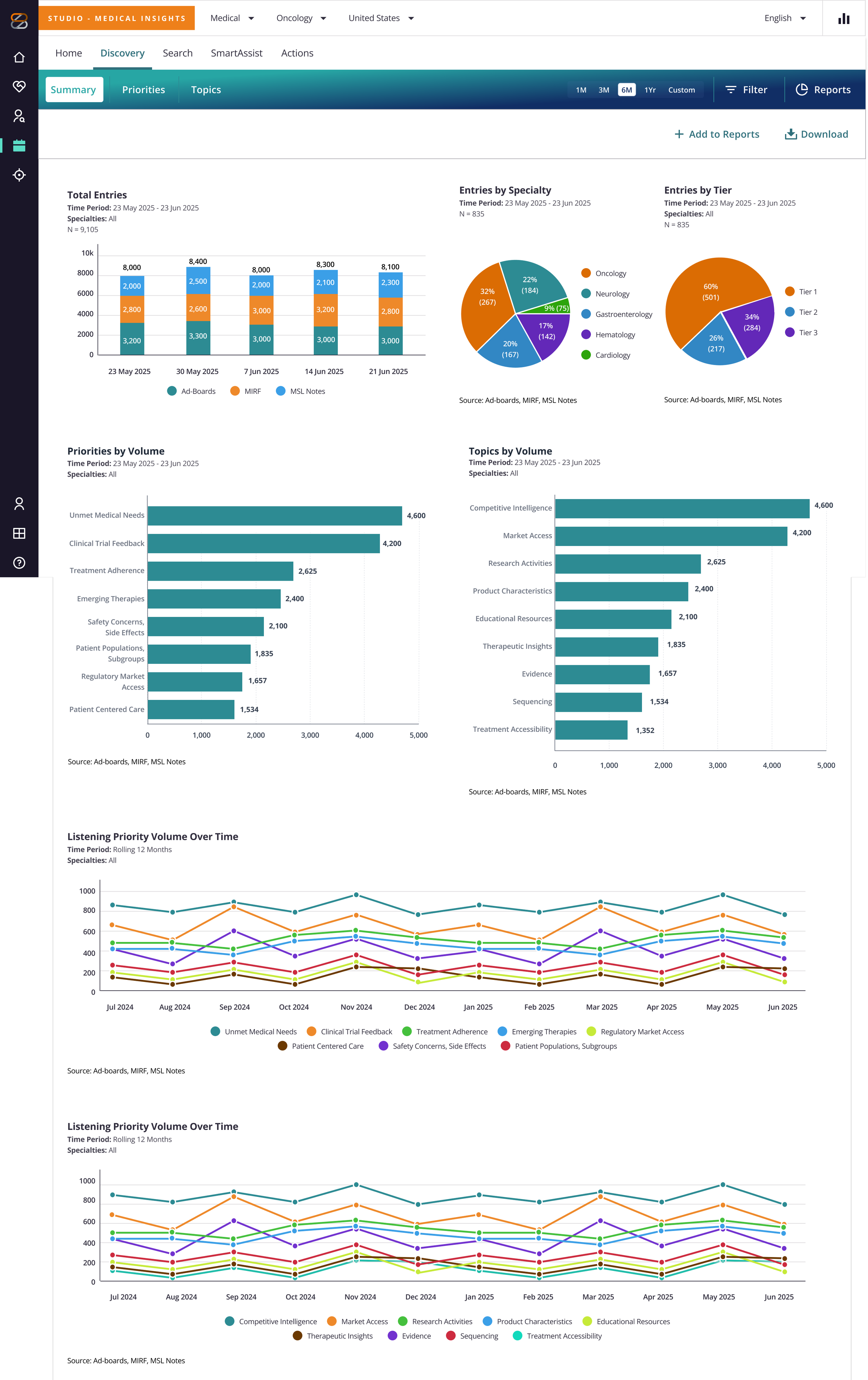
Previously non-existent, the newly added Reporting Summary addresses our biggest competitor gap.
Users no longer have to manually create data visualizations or regenerate existing analysis to get updated visualizations.
Users have the ability to export to PowerPoint or PDF formats if needed.
Charts and visualizations are also an easy implementation in proportion to the visual interest and payoff, so this was a no-brainer add.
After
After

“Make it more modern”
Feedback around making the UI more “modern” was related to the appearance of our components and lack of color.
From a visual perspective, stakeholders felt there were too many “boxes and lines” on the UI, so I made sure to address that wherever possible.
I introduced a gradient header to all screens as a landmark for screen specific actions such as filters, search functions, and sub-navigation.
Also the bonus of adding color and visual interest to the screen.
Redesigned the priority cards to fit more on screen at a time, freeing up space for topic lists below, creating a more actionable landing page experience.
“Make it more intuitive”
A significant part of the “intuitive” feedback pointed at the tab organization and nomenclature.
The Configuration tab, meant for admin level users on one of the origin products, was actually totally irrelevant for our main users so I removed it entirely.
The Summaries tab created confusion, since topic summaries are prominently displayed on the Topic Analysis screen.
I renamed it to the more conventional Home tab.Topic Analysis was renamed to Discovery at our Principal’s request.

Re-organized
The topic summary is the first thing users seek on this screen, so it is now centered at the top of the screen, as opposed to being below the fold, under the chart.
References, deemed not particularly important, are placed behind a tab.
This gave us additional space to bring the geography view out of the toggle button to the surface level of the UI, creating a less cluttered and more eye-catching interface.
Some of the feedback around the app being “not intuitive” was related to features and functions seen in competitor apps, and therefore expected in Studio. Filtering was a significant gap, so including it on the new header would increase parity with competitors.
Displaying the entire topic summary while following WCAG line length criteria (80 characters was about 720 px).
De-cluttered the UI
Reduced the amount of borders and lines on components, also lending to a less dated appearance.
Removed entry counts (deemed not useful) from the Priority and Topic list in the left panel.
After

Improved usability and accessibility
The Search Entries/Search screen was emphasized for redesign due to its prominence in the insight generation user story. Users are able to come here and syntheisze their own insights using the raw data from MSL notes.
We wanted to display the entire entry while following WCAG line length criteria (80 characters was about 720 px), so its no longer truncated and collapsible.
Reorganized and de-cluttered the table by removing columns deemed irrelevant by stakeholders.
Epilogue
Our commercialization team said clients were impressed and surprised by the new “Modern” and “Intuitive” UI.
There were multiple requests for client demos immediately after the conference.
Since the MAPS conference, we were able to launch our product with five clients
(Pfizer, NNCI, Phathom, Replimmune, and Apellis) and generate $550K in revenue.
I am still actively working on the product as its lead designer.
Our official H1 Update
